♠ 27082014 ♠ Typography Poster Design ♠
Quote used : "The starting point of all achievement is desire." - Napoleon Hill
█ REFERENCE █
 |
| I drew few white lines as the reference image on the side. |
 |
| I changed the texture of the background to make it looks real. |
 |
| The words "STARTING POINT" are written based on the method shown in the video above. |


 |
| The arrow is drawn by pen tool (based on the image on the right). |

█ END RESULT █


For this typography poster, I do not refer to any existing poster. It is a word-based poster which consists of words and arrows. The reason why I choose this background is because I want to show that the starting line of track will also be the starting point of our life. As for the arrows, you can see that there are arrows in opposite direction. In life, everyone will choose their own path, it might be correct but it can be wrong also. However, if you have the desire, you can reach your goal and accomplish your achievement in one day.
♠ 03092014 ♠ Magazine Cover Design ♠
█ REFERENCE █

This image is the reference i used when i am trying to make a magazine cover. I choose this magazine cover as my reference because it is challenging. I can learn typographical arrangement and the words are typed according to the layout. It looks neat and attractive.
 |
| The artboard is divided into 5*4 boxes. Then the burger image is put in the middle. The logo is done. |
 |
| Words on the bottom are typed. Words on the left-hand side are typed. |
 |
| Words on the right-hand side are typed. The words on the upper right corner are also been typed. |
█ END RESULT █


These are what I made according to the reference I used. It is not exactly the same and I have modified some parts. For example, the magazine logo. The words of original logo is made of Gothic font style but the new one is made of script font style. Besides, the font I used is also not as square as the original one. Hence, I can concluded that different font style can give different impression to people. Last but not least, I also tried out a version with gradient. Red-yellow gradient can trigger our appetite so that it is more suitable for food magazine.
♠ 04092014 ♠ Logo & Namecard Design ♠
 |
| Sketch of 10 logos. |
 |
| Sketch with Artline. |
 |
| Use pen tool to draw the shape. |
 |
| Duplicate layers and add the word 'studio'. |
 |
| Use rectangle tool to create shape with same length. |
 |
| Duplicate layer and drag it smaller. Then, add the word 'studio'. |
 |
| Contact information and company's logo is added. |
 |
| Circle dots with pink-purple gradient is the background of the name card. This is because purple associated with creativity whereas pink indicated the feeling of caring. |
█ END RESULT █
(The words I use are 'RY')
 |
| This word-based logo is the combination of "R" and "Y". |
 |
| This word-based logo is the combination of "r" and "y". |
 |
| This is the name card I made with the first logo. |
♠ 10092014 ♠ Beautify Image ♠
█ REFERENCE █

The steps I beautified this image will be shown through the screenshots below:
 |
| I use clone stamp tool & blur tool to make her skin looks smoother. |
 |
| I go (Filter > Liquify) to make her eyes bigger. After that, I also change her eyes' color from yellow to blue. |
 |
| I use burn tool & dodge tool to make her hair looks darker and her teeth looks whiter. I also duplicate a layer and make the background looks whiter. |
 |
| Lastly, I change the levels, curves & color balance of this image. |
█ END RESULT █

The effect I wanted for this image is to make it looks cooler. I am satisfied with this effect and now it looks more like a model shooting photo than the previous one. The model looks younger and more energetic to the audience.
♠ 11092014 ♠ People with Animal Head ♠
█ REFERENCE █


Now, I am going to combine these three pictures. The final result will be a human's body with an animal head. The steps will be shown in the following screenshots.
 |
| I removed the background of this man by using quick selection tool. |
 |
| The background of this dog is also been removed by using the same method. |
 |
| I put the layer of dog's head behind the layer of man. |
 |
| I go (Edit > Puppet Wrap) to arrange the position of the dog's head. |
 |
| I removed the background of this image and duplicate few. Some of it are flipped horizontally. |
 |
| All the layers of the puppies are put nicely in order to make it looks as one. All these layers are put behind the man with dog's head. |
 |
| I put some fur of the dog on the hands of the man. Lastly, I change the hue/saturation and color balance of the image. This is to avoid background image from distracting the main character. |
█ END RESULT █

The dog I used is Golden Retriever, therefore, the background I put is the puppies of it. The effect I wanted to create is a Golden Retriever with smart and intelligent look. A successful leader can lead his men to higher position is what I comprehend about this image.
♠ 17092014 ♠ Texture Effect & Filter Gallery ♠
█ REFERENCE █


 |
| I duplicated a layer and cropped it half. Then, I duplicated that layer and flipped horizontally to make it be symmetrical. |
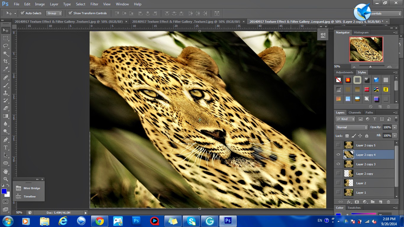 |
| Duplicate layer, skew it to 45°, then (Filter > Pixelate > Mosaic), skew it back to its original position. Duplicate another layer, apply the same effects but in different direction. |
 |
| Here is the effect after the mosaic applied. |
 |
| I added the textures on the image. |
 |
| I changed the mode and the transparency of the textures used. Besides, I also erased unnecessary parts of the textures. |
 |
| I added another texture to fill up the empty space on the side. Lastly, I changed the brightness/contrast, hue/saturation, curves & color balance of the entire image. |
█ END RESULT █


The original image is a leopard with the forest as the background and I want to make it looks like a king with the dim golden background. The effects of the textures are trying to make the leopard looks more dignified.
♠ 18092014 ♠ Movie Poster & Magazine Cover ♠
█ REFERENCE █

 |
| Korean Girl Group - TaeTiSeo(TTS) |
 |
| SD Dolls Part1 |
 |
| SD Dolls Part2 |
 |
| Building etc. |
 |
| Others |


Remove all the backgrounds.


Arrange all the materials in suitable position.
Change all the hue/saturation, levels, curves to make them look harmony.
 |
| Black color as the base color of background. |
 |
| Add hue/saturation layer to change pink to bronze. |
 |
| Add curves layer to make color looks darker. |
 |
| Add hue/saturation layer again to low down its saturation. |
 |
| Add texture to the background. Last but not least, add the information of the movie. |


Make a grid layer as reference for position.
Place the movie poster in the middle.
Then, type all the words.
 |
| Change the font style and rearrange the position of the words. *Remove unnecessary words. |
█ END RESULT █


No comments:
New comments are not allowed.